Context
The user acquisition flow is crucial for a major audio streaming platform like Beek, encompassing various components like ads, referral links, social media posts, and landing pages. The landing pages serve as the focal point where these elements converge, creating a compelling narrative. Beek's narrative towards users was found to significantly impact acquisition, as indicated by the data.
Challenge
The goal was to optimize the main landing page to boost user conversion and improve user acquisition flow promptly. Overcoming time constraints, a no-code approach was adopted for swift iterations. The challenge involved mastering a new tool for page design and understanding acquisition funnel terminology.
My Role
I led the design (UX/UI) of this project also worked along a marketing designer fellow and the rest of my squad.
Tools
Figma
Unbounce
Google Analytics
Hotjar
Design Process
Research
The process began with a thorough review of data from Google Analytics, which highlighted a low click-through rate on the page's call-to-action (CTA). Additionally, insights gathered from user feedback to the support team revealed discrepancies between ad messaging and page content, along with confusion about the application's purpose. Finally, industry research was conducted before commencing the page iteration.
Ideation
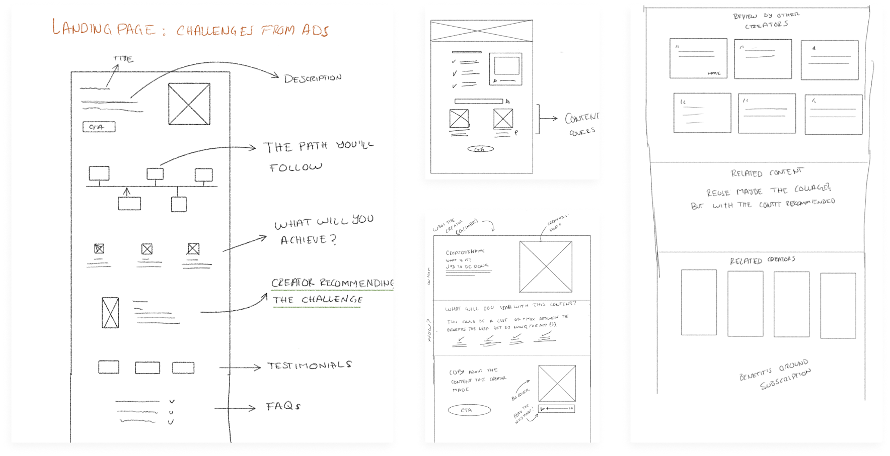
I started organizing the information that we would display on the page:
- What is Beek?
- What this app contains
- Show the audio content of the app
- User validation (testimonials)
- Frecuently Answer Questions section
- Closing section
Using the established structure, we developed various landing pages that enabled the acquisition team to experiment independently. I supported a colleague in mastering the new tool and page structure to optimize experimentation. Throughout the process, I held feedback sessions with diverse stakeholders to iteratively refine the page before finalizing its upload.
Wireframes
I began working ong the site's information architecture which. As the application's architecture was already user-friendly, I kept the design similar to ensure ease of use for existing users but also for the new ones. After that, I created low-fidelity wireframes and used them to develop a proposal to present it to the stakeholders.
User interface
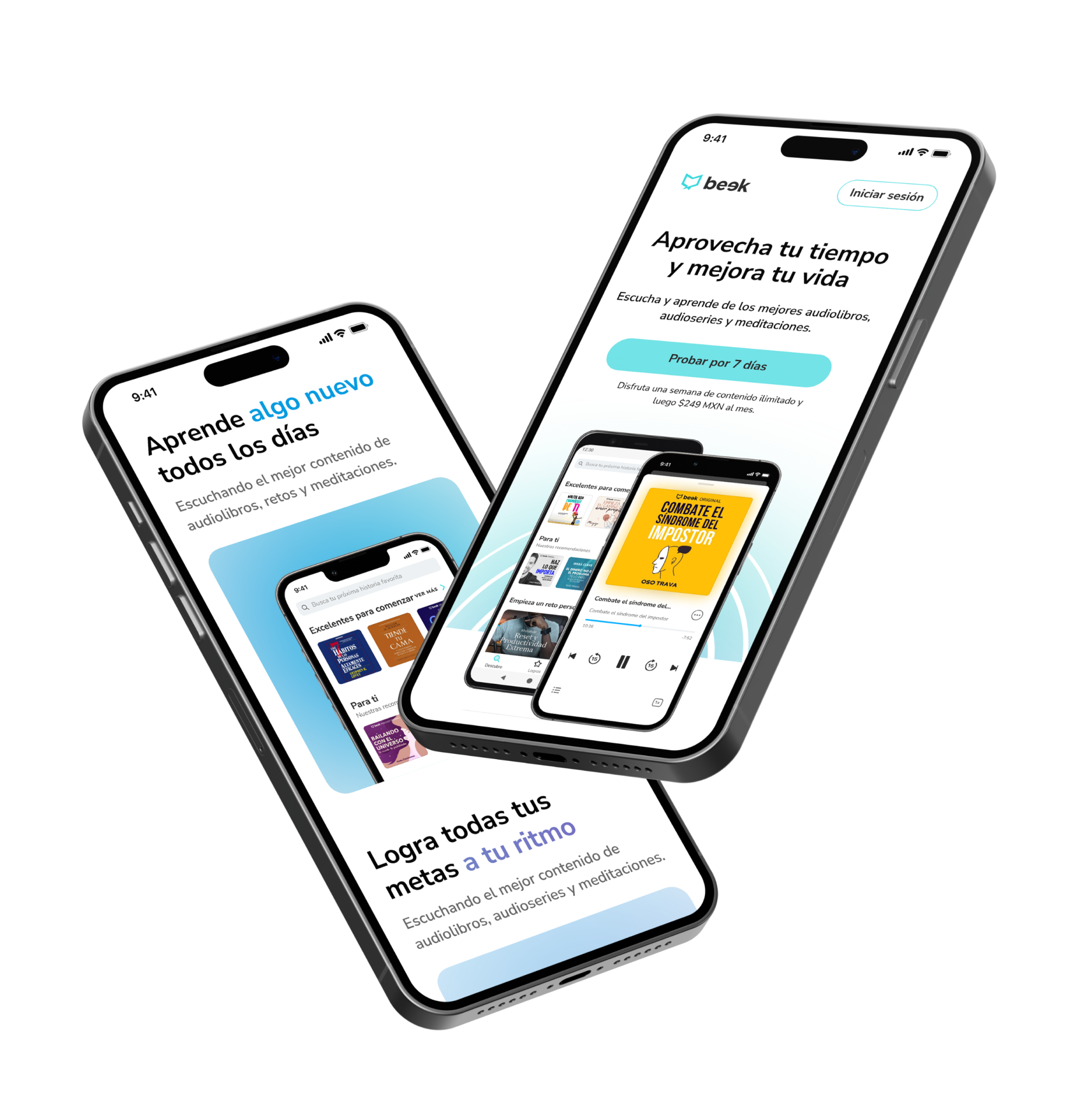
The landing page was created using Figma and brought to life through Unbounce, delivering fast and impactful results. As a fully no-code project, it enabled swift and efficient execution.

Learnings
- Click-through rate (CTR) increased by 250% in a month, making it the highest-converting page in the startup's history.
- The experiment positively impacted the metric for users starting free trials.
- The existing landing page was replaced with the new one, built using Unbounce and coded by the engineering team.
- Quick learning of new tools and enhanced understanding of acquisition and marketing concepts were achieved during the process.
Shout outs!
This is a message to the acquisition squad, which consists of Eduardo, Product Manager; Letty, Marketing Designer; Dani, Marketer; and Miguel, Head of Growth.